- Adding columns to a report
- Adding text to a report
- Adding drawing controls to a report
- Adding a group box to a report
- Adding pictures to a report
- Adding computed fields to a report
- Adding buttons to a report
- Adding graphs to a report
- Adding InkPicture controls to a report
- Adding OLE controls to a report
- Adding reports to a report
- Adding table blob controls to a report
- Adding tooltips to a DataWindow control
This section describes adding controls to enhance your report.
You can add columns that are included in the data source to a report. When you first create a report, each of the columns in the data source is automatically placed in the report. Typically, you would add a column to restore one that you had deleted from the report, or to display the column more than once in the report.
Adding columns not previously retrieved to the data source
To specify that you want to retrieve a column not previously retrieved (that is, add a column to the data source), you must modify the data source.
To add a column from the data source to a report:
-
Select Insert>Control>Column from the menu bar.
-
Click where you want to place the column.
The Select Column dialog box displays, listing all columns included in the data source of the report.
-
Select the column and click OK.
Insert columns instead of copying them
If you want to add a column from the DataWindow definition to a DataWindow, always use Insert>Control>Column. You might see unexpected results if you copy a column from one report to another if they both reference the same column but the column order is different. This is because copying a column copies a reference to the column's id in the DataWindow definition.
Suppose d_first and d_second both have first_name and last_name columns, but first_name is column 1 in d_first and column 2 in d_second. If you delete the first_name column in d_second and paste column 1 from d_first in its place, both columns in d_second display the last_name column in the Preview view, because both columns now have a column id of 1.
When InfoMaker generates a basic report from a presentation style and data source, it places columns and their headings in the Report painter. You can add text anywhere you want to make the report easier to understand.
To add text to a report:
-
Select Insert>Control>Text from the menu bar.
-
Click where you want the text.
InfoMaker places the text control in the Design view and displays the word text.
-
Type the text you want.
-
(Optional) Change the font, size, style, and alignment for the text using the StyleBar.
Displaying an ampersand character
If you want to display an ampersand character, type a double ampersand in the Text field. A single ampersand causes the next character to display with an underscore because it is used to indicate accelerator keys.
You can add the following drawing controls to a report to enhance its appearance:
Rectangle
RoundRectangle
Line
Oval
To place a drawing control in a report:
-
Select the drawing control from the Insert>Control menu.
-
Click where you want the control to display.
-
Resize or move the drawing control as needed.
-
Use the drawing control's Properties view to change its properties as needed.
For example, you might want to specify a fill color for a rectangle or thickness for a line.
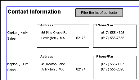
To visually enhance the layout of a report, you can add a group box. A group box is a static frame used to group and label a set of controls in a report. The following example shows two group boxes in a report. The Address group box groups address information and the Phone/Fax group box groups telephone numbers.
You can place pictures, such as your company logo, in a report to enhance its appearance. If you place a picture in the header, summary, or footer band of the report, the picture displays each time the content of that band displays. If you place the picture in the detail band of the report, it displays in each row.
To place a picture in a report:
-
Select Insert>Control>Picture from the menu bar.
-
Click where you want the picture to display.
The Select Picture dialog box displays.
-
Use the Browse button to find the file or enter a file name in the File Name box. Then click Open.
The picture must be a bitmap (BMP), runlength-encoded (RLE), Windows metafile (WMF), Graphics Interchange Format (GIF), or Joint Photographic Experts Group (JPEG) file.
-
Display the pop-up menu and select Original Size to display the image in its original size.
You can use the mouse to change the size of the image in the Report painter.
-
Select the Invert Image check box on the Appearance page in the Properties view to display the picture with its colors inverted.
Tips for using pictures
To display a different picture for each row of data, retrieve a column containing picture file names from the database. For more information, see Specifying additional properties for character columns.
To compute a picture name at runtime, use the Bitmap function in the expression defining a computed field. If you change the image in the Picture control in a report, you need to reset the original size property. The property automatically reverts to the default setting when you change the image.
You can use computed fields in any band of the report. Typical uses with examples include:
-
Calculations based on column data that change for each retrieved row
If you retrieve yearly salary, you can define a computed field in the detail band that displays monthly salary: Salary / 12.
-
Summary statistics of the data
In a grouped report, you can use a computed field to calculate the totals of a column, such as salary, for each group: sum (salary for group 1).
-
Concatenated fields
If you retrieve first name and last name, you can define a computed field that concatenates the values so they appear with only one space between them: Fname + " " + Lname.
-
System information
You can place the current date and time in a report's header using the built-in functions Today() and Now() in computed fields.
When creating a report, you can define computed columns and computed fields as follows:
-
In the SQL Select painter, you can define computed columns when you are defining the SELECT statement that will be used to retrieve data into the report.
-
In the Report painter, you can define computed fields after you have defined the SELECT statement (or other data source).
The difference between the two ways
When you define the computed column in the SQL Select painter, the value is calculated by the DBMS when the data is retrieved. The computed column's value does not change until data has been updated and retrieved again.
When you define the computed field in the Report painter, the value of the column is calculated in the report after the data has been retrieved.
To define a computed field in the Report painter Design view:
-
Select Insert>Control>Computed Field from the menu bar.
-
Click where you want to place the computed field.
If the calculation is to be based on column data that changes for each row, make sure you place the computed field in the detail band.
The Modify Expression dialog box displays, listing:
-
InfoMaker expression functions you can use in the computed field
-
The columns in the report
-
Operators and parentheses
-
-
Enter the expression that defines the computed field as described in Entering the expression.
-
(Optional) Click Verify to test the expression.
InfoMaker analyzes the expression.
-
Click OK.
You can enter any valid InfoMaker expression when defining a computed field. You can paste operators, columns, and InfoMaker expression functions into the expression from information in the Modify Expression dialog box. Use the + operator to concatenate strings.
InfoMaker expressions
You are entering an InfoMaker expression, not a SQL expression processed by the DBMS, so the expression follows the rules for InfoMaker expressions. For complete information about InfoMaker expressions, see Operators and Expressions
Referring to next and previous rows
You can refer to other rows in a computed field. This is particularly useful in N-Up reports when you want to refer to another row in the detail band. Use this syntax:
ColumnName[x]
where x is an integer. 0 refers to the current row (or first row in the detail band), 1 refers to the next row, -1 refers to the previous row, and so on.
Examples
The following table shows some examples of computed fields.
|
To display |
Enter this expression |
In this band |
|---|---|---|
|
Current date at top of each page |
Today() |
Header |
|
Current time at top of each page |
Now() |
Header |
|
Current page at bottom of each page |
Page() |
Footer |
|
Total page count at bottom of each page |
PageCount() |
Footer |
|
Concatenation of Fname and Lname columns for each row |
Fname + " " + Lname |
Detail |
|
Monthly salary if Salary column contains annual salary |
Salary / 12 |
Detail |
|
Four asterisks if the value of the Salary column is greater than $50,000 |
IF(Salary> 50000, "****", "") |
Detail |
|
Average salary of all retrieved rows |
Avg(Salary) |
Summary |
|
Count of retrieved rows, assuming each row contains a value for EmpID |
Count(EmpID) |
Summary |
For complete information about the functions you can use in computed fields in the Report painter, see DataWindow Expression and InfoMaker Functions.
Menu options and buttons for common functions
InfoMaker provides a quick way to create computed fields that summarize values in the detail band, display the current date, or show the current page number.
To summarize values:
-
Select one or more columns in the DataWindow object's detail band.
-
Select one of the options at the bottom of the cascading menu: Average, Count, or Sum.
The same options are available at the bottom of the Controls drop-down toolbar on the PainterBar.
InfoMaker places a computed field in the summary band or in the group trailer band if the report is grouped. The band is resized automatically to hold the computed field. If there is already a computed field that matches the one being generated, it is skipped.
To insert a computed field for the current date or page number:
-
Select Insert>Control from the menu bar.
-
Select Today() or Page n of n from the options at the bottom of the cascading menu.
The same options are available at the bottom of the Controls drop-down toolbar on the PainterBar.
-
Click anywhere in the DataWindow object.
If you selected Today, InfoMaker inserts a computed field containing this expression: Today(). For Page n of n, the computed field contains this expression: 'Page ' + page() + ' of ' + pageCount().
Adding custom buttons that place computed fields
You can add buttons to the PainterBar in the Report painter that place computed fields using any of the aggregate functions, such as Max, Min, and Median.
To customize the PainterBar with custom buttons for placing computed fields:
-
Place the mouse pointer over the PainterBar and select Customize from the pop-up menu.
The Customize dialog box displays.
-
Click Custom in the Select palette group to display the set of custom buttons.
-
Drag a custom button into the Current toolbar group and release it.
The Toolbar Item Command dialog box displays.
-
Click the Function button.
The Function For Toolbar dialog box displays.
-
Select a function and click OK.
You return to the Toolbar Item Command dialog box.
-
Specify text and microhelp that displays for the button, and click OK.
InfoMaker places the new button in the PainterBar. You can click it to add a computed field to your report the same way you use the built-in Sum button.
The Button control is a command or picture button that can be placed in a report. When clicked at runtime, the button activates the action you assign to it.
For example, you can place a button in a report and specify that clicking it opens the Filter dialog box, where users can specify a filter to be applied to the currently retrieved data.
To add a button to a report:
Be careful when putting buttons in the detail band
Buttons in the detail band repeat for every row of data, which is not always desirable. Buttons in the detail band are not visible during retrieval, so a Cancel button in the detail band would be unavailable when needed.
-
Select Insert>Control>Button from the menu bar.
-
Click where you want the button to display.
You may find it useful to put a Delete button or an Insert button in the detail band. Clicking a Delete button in the detail band will delete the row next to the button clicked. Clicking an Insert button in the detail band will insert a row following the current row.
-
With the button still selected, type the text to display on the button in the PainterBar or on the General page of the Properties view.
-
Select the action you want to assign to the button from the Action drop-down list on the General page of the Properties view.
For information about actions, see Actions assignable to buttons in reports.
-
If you want to add a picture to the button, select the Action Default Picture check box or enter the name of the Picture file to display on the button.
You can choose whether to display buttons in print preview or in printed output. You control this in the Properties view for the report (not the Properties view for the button).
To control the display of buttons in a report in print preview and on printed output:
-
Display the report's Properties view with the Print Specification page on top.
-
Select the Display Buttons -- Print check box.
The buttons are included in the printed output when the report is printed.
-
Select the Display Buttons -- Print Preview check box.
The buttons display on the screen when viewing the report in print preview.
The following table shows the actions you can assign to a button in a report.
|
Action |
What it does |
|---|---|
|
Cancel |
Cancels a retrieval that has been started with the option to yield. |
|
Filter |
Displays Filter dialog box and filters as specified. |
|
Page First |
Scrolls to the first page. |
|
Page Last |
Scrolls to the last page. |
|
Page Next |
Scrolls to the next page. |
|
Page Prior |
Scrolls to the prior page. |
|
Preview With Rulers |
Toggles between rulers on and off. |
|
|
Prints one copy of the DataWindow object. |
|
Retrieve |
Retrieves rows from the database. The option to yield is not automatically turned on. |
|
Retrieve (Yield) |
Retrieves rows from the database. Before retrieval actually occurs, option to yield is turned on; this will allow the Cancel action to take effect during a long retrieve. |
|
Save Rows As |
Displays Save As dialog box and saves rows in the format specified. |
|
Sort |
Displays Sort dialog box and sorts as specified. |
Graphs are one of the best ways to present information. For example, if your report displays sales information over the course of a year, you can easily build a graph in a report to display the information visually.
InfoMaker offers many types of graphs and provides you with the ability to control the appearance of a graph to best meet your application's needs.
For information on using graphs, see Working with Graphs
The InkPicture control is designed for use on a Tablet PC and provides the ability to capture ink input from users of Tablet PCs. The control displays signatures, drawings, and other annotations that do not need to be recognized as text.
You use an InkPicture control with a table that has a blob column to store the ink data, and optionally a second blob column to provide a background image.
The InkPicture control behaves like a Picture control that can contain annotation. You can associate a picture with the control to display annotations that have been saved with the picture. If the control contains signatures, you usually do not associate a picture with it.
To add an InkPicture control to a report, select Insert>Control>InkPicture from the menu. A dialog box displays to let you specify a blob column to store the ink data and another to use as a background image. After you specify the columns in the dialog box, the InkPicture control displays in the DataWindow and its Properties view includes a Definition tab page where you can view or change the column definitions.
If you insert the InkPicture control into a N-Up report, you should specify the Row In Detail so the correct image displays. For example, if you have three rows in the detail band, you might enter 1 for the ink picture associated with the first, 2 for the second, and 3 for the third.
InkPicture controls are not supported in Crosstab reports.
You can add the following to a report:
-
A column that contains a database binary large object (a blob object) using OLE 2.0
-
OLE 2.0 objects
For information on using OLE in a report, see Using OLE in a Report
You can nest reports (nonupdatable DataWindow objects) in a report.
For information on nesting reports, see Using Nested Reports
Use the table blob control to add rich text, image, or XPS blobs to the report.
Tooltips display text when the pointer pauses over a DataWindow column or control. This text can be used to explain the purpose of the column or control. To use this feature, select the column or control for which you want to create a tooltip and then select the Tooltip tab in the Properties view. You can use the tab to specify:
-
Text for the tooltip
-
Title for the tooltip
-
Color of the background and text
-
Icon for the tooltip
-
Delay before the tooltip appears and disappears
-
Whether the tooltip appears as a rectangle or callout bubble
For more information, see Tooltip.property in the online Help.
